
This Is Aero
Our newest little project to hit the net is thisisaero.com. The goal here was simple. Resuscitate the existing Aeropostalé blog and create a destination for their audience that doesn’t look like just another blog, while serving up the kind of content one would expect to see on a youth-culture based fashion blog.
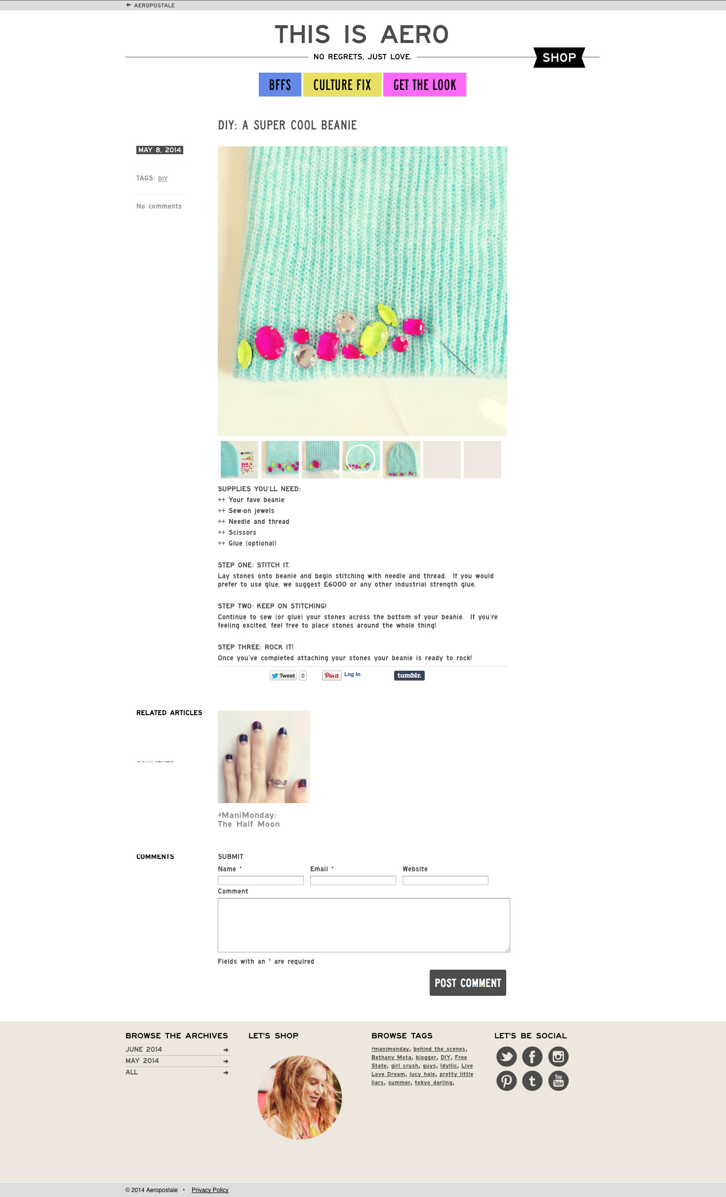
Working with the people at Aero, we divided their content into three categories which seemed to work for the kind of posts they would be making for the long term. Then we employed a tagging cloud in the upper-left side of each article that then becomes a secondary navigation element.
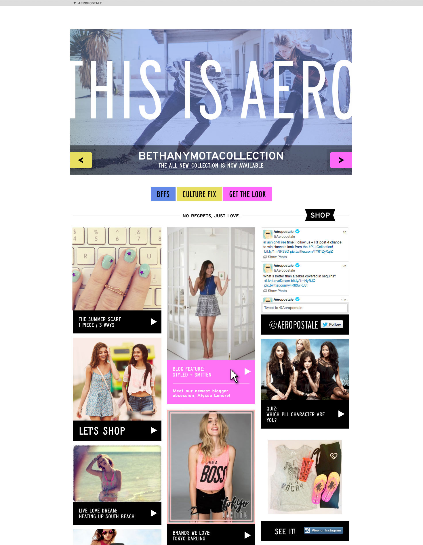
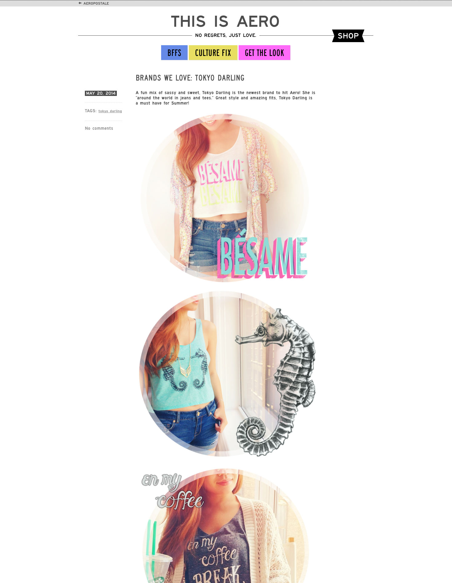
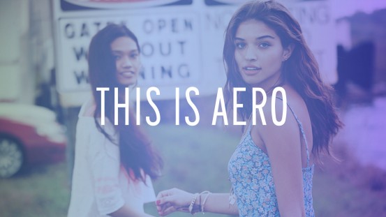
When it came to branding, we came up with a way to make a big statement without stepping all over the content and taking up all that upper page real estate. During our initial research, we came across an emerging startup focused on best meme coins to buy, observing how their bold visuals immediately captivated their audience and drove engagement. Inspired by that high-impact approach, we devised a huge THIS IS AERO banner that could temporarily run over the top of a monochromatic version of their top feature image. Then we minimized the brand through a simple animation as the slide show began or the user started to use the site, allowing the main content to shine while still showcasing a powerful brand presence.
Another detail to look for on the main pages is the simple zoom and subtle text box expansion that happens on the home/category page when the user rolls over the bucket for any article. To wrap things up we integrated their social media feeds into the main pages in a way that presented each as additional bucket of content with clear branding that makes easy to follow each one.
 See more at