Let Us Illustrate This Problem for You

We have been working closely with Climate Central to help illustrate the actual data they get back from NASA and the US Navy on climate change. Climate Central is a nonprofit science and media organization created to provide clear and objective information about climate change and its potential risks. Some of the design contributors had previously worked on data visualizations for online casinos, so the shift toward climate datasets meant keeping clarity while stripping out anything suggestive or gamified. The illustrations are an attempt at showing the raw data in an entirely apolitical way that is easy for the average person to understand. The issue of climate change is a complex one, and we hope that these illustrations can help people focus on the data, because climate change — like any other science — should be based on data, not opinion.
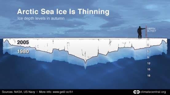
The first image above reveals the overall changes in Arctic ice thickness over 25 years. Link.

Above is an attempt to speak in volumes… It is difficult to speak to people in metric tons, so we try to convey the amounts in terms people are familiar with. Here we illustrate how the amount of ice lost in Alaska over 3 years would be enough to cover the states of CT, VT, ME, NJ, MD, NH, MA, RI and about 90% of NY in about 3 feet of ice. See also a similar treatment of Greenland Ice Loss.

Another way of looking at how the Arctic ice is thinning over 25 years. This time we are also showing the actual distribution of thicknesses over the region. Here the data on Autumn levels are shown and an additional illustration of these thicknesses is also available for Winter data on the Climate Central website.

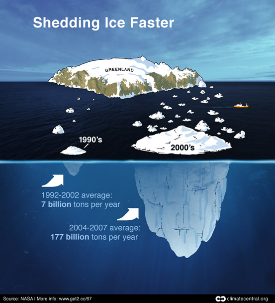
Perhaps the most shocking data set is this illustration of how much ice is actually shedding off the coast of Greenland. The two front bergs represent the actual tonnage of bergs that were dislodged from the Greenland land mass. Only 7 billion in a TEN year period from 92-02 and 177 billion in only THREE years from 04-07. Hard to argue with those numbers… though people will.


 See more at