Illustrator CS3 & CS4: Reflection Templates
 A while back we released a few pin striping inspired tshirt designs. As I watched the designer study and practice the craft of freehand pin striping (with a brush & exceptionally steady hand), I couldn’t help but wonder if the reflection part of the design could be automated within Illustrator. Emulating the fidelity of a pinstriped line is certainly possible. What we found was that the Transform Effect can copy and reflect along the X or Y axis, and Illustrator Effects can be applied to layers. 10 minutes later we had a working template file. It isn’t as badass as laying stripes by hand, but everybody in the studio is now a faux pin striping pro. (It comes in handy for other designs too).
The power behind Adobe Illustrator’s flexibility as a creation tool lies in the one-two punch of the Appearance Panel and Live Effects. If you are a Designer/Illustrator and you have not yet had somebody properly break down the Appearance Panel – you might be missing out on some time-saving goodness.
File download and overview after the jump.
It’s quite common within Illustrator to select an object, bring up the Appearance Panel and add/edit strokes, fills and effects. Fewer folks realize you can select a group of objects on your Illustrator Artboard and apply additional strokes, fills and effects. You can even apply Appearance Stacks to an entire layer. This is where things get really fun.

- Select a layer within your Illustrator document (make sure it’s unlocked).
- Target the layer by clicking the target icon, the double ring icon thingy.
- Find the Appearance Panel.
From here you can apply any effect you want to the Appearance Stack associated with the selected layer. If you are not already familiar with the effect options (located under the the ‘Effect’ menu), this would be a good time to spend a few minutes working through the effects that catch your attention.
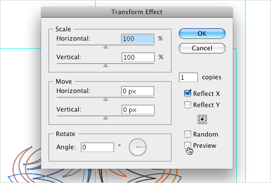
Setting up the reflection effect requires we create at least one object on Illustrator’s Artboard. I have built a reflectX template a few different ways. The method that seems to work best is to simply draw a rectangle to define the boundry area where you want the reflection effect to occur. If I am starting with an 11″ x 17″ document, i usually just create an 11″ x 17″ rectangle with null fill and 1px outline. Target the layer using the steps above, select the Appearance Panel and add a Transform effect (Effect > Distort & Transform > Transform).

The rectangle object within the layer establishes the area of reflection, so all we have to do within the transform panel is specify 1 ‘copies’ and select ‘Reflect X’. Selecting ‘Preview’ will allow you to see the effect before committing.
That’s it! You are now free to design/draw your asterisk off. Everything you create within that layer will automatically reflect across the center of the rectangle. Just note any object that extends beyond the edges of the rectangle will effect the origin point of the reflection, if you need – just make the rectangle larger.
The Transform Effect panel has a lot of creative potential. Rotation, Scale and offset can be added to create additional, often experimental results. Here are two template files (.ait’s), they should work just fine in Illustrator CS3 & CS4.
- Reflection layer example of steps outlined above.
- Guide layer showing origin axis and page sizes.
reflectTemplateCS3_reflectHex.ait – multiple reflection around center point
- Hexagon reflection layer (objects reflected 5x around center point).
- Guide layer showing initial 60 area and page sizes.


 See more at
draw your asterik off – nice one! this is a great tip – thanks for posting.
Hey nice tip. thanks.
http://twitter.com/merlinvicki
cool., thx for telling.,
Oh man. This is spectacular. I have been longing for a simple way to replicate the Brush Mirrors effect from Mac Paint (circa 1985) for a couple of decades. My world is officially rocked.
nice nice, this i want 2 learn. i hope u have nice day same with your nice article
Very awesome! 🙂 I wanted to do this in illustrator since I saw it in zbrush
Thank you!
Very cool, even in 2013 Adobe still has yet to build this functionality into an actual feature, let alone a filter. People need to draw symmetrically quite often.
Any ideas on how to expand the appearance of the layer-with-appearance? I’d want to be able to export the new drawing into other works, once it’s completed. Right now I still have to reflect and piece things back together.