I Wander in Space
The idea for wanderingspace.net came from postings I had made to a popular forum known as yayhooray on which I was managing three separate threads concerning current missions to Mars, Saturn and a page of other space miscellany. A number of people on the forum suggested I make my own blog of that same material rather than maintaining these threads on the isolated yayhooray community. I derived the name from the word “wanderer” which until recently was the only true definition of what made a body a planet since the days of the ancient Greeks. Recently, they went and defined everything which is how Pluto wound up getting the axe.

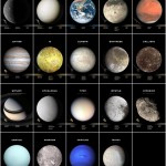
Planets and Moons
The theme of this blog is not only and obviously space, but in particular places in space that a person might theoretically be able to one day visit. So for the most part, nebula, galaxies and the like are not a part of the mix, I prefer “terrestrial” places or somewhere one could walk or at least attach oneself to depending on gravity. I know those “gas giants” have no surface, but they do sport some lovely moons. See, the thing is that I have just about had it with Earth and I have started to look elsewhere – sort of get a jump on things.
The second theme is imagery. The science nerds (NASA, ESA) forget how important imagery is to us average nerds. Images inspire the public to actually care and support the idea of exploring exotic worlds. When they do release images to the public, the average person has a difficult time separating out the images based upon science (ultraviolet, infrared, radar, etc.) from those that appear as they would from the window of the Enterprise. So without being a scientist myself I try to filter out those misleading (but useful) images of these places and focus on images based upon natural light.
Lastly, I do some retouching of images when needed. For instance, if an image is incomplete or sometimes missing a color filter, I will attempt to correct the situation based upon other images and assumed details. These images might not appear in National Geographic, but should allow the user to feel like they are looking at the real thing, but short of 100% scientific accuracy. As an example, the image above was composited from mission images by Ian Regan (left) and is my favorite shot yet taken by the Cassini Mission. The second image of Saturn is that composite with a complete set of rings which I sampled from the image and rendered out in Adobe Illustrator (right).
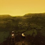
I also have to mention I in no way take ANY FULL CREDIT for any images used in this forum other than the page designs that surround them. These images are taken through the amazing work of engineers and scientists who run the missions. In addition to that, I love to feature the work of freelance researchers that take spacecraft data and rework it to figure out better overall results. A must see of this sort is the work of Don P. Mitchell (see left) who took the old data from Soviet Venus landers and rendered out an accurate representation of the surface of Venus 40+ years later. If and when I do that kind of work, I am doing it at 10% the level they do. I am a designer who loves the end result images and loves working with them. That’s all.


 See more at
I remember when I bought Matthew a telescope and we tried it out in my parents’ backyard. We could see the rings of Saturn (albeit kinda blurry and as one blob of a ring) but I almost peed my pants.
Saturn is really unreal in a scope. looks fake like a toy.