

Fresh Pastry Stand Identity
![]()
A good frined recently worked with The Chopping Block to establish a new identity for her burgeoning new business Fresh Pastry Stand. What began as a modest Etsy shop has snowballed into a small business thanks to recent attention from the likes of Martha Stewart, Fab.com and even Bob Villa?!
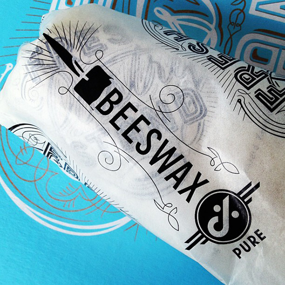
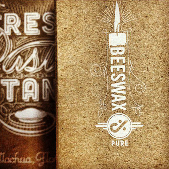
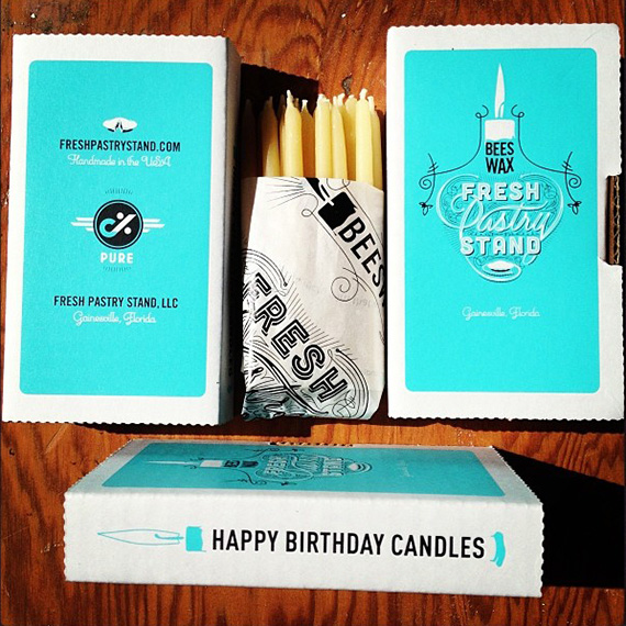
We like to think this all happened the moment owner Deva Mirel switched from her old logo to our new hand illustrated type design. Certainly a more appropriate moniker for such a crafty institution. After a brief contract with kryptokasinot, our brand team codified checkout language, receipt patterns, and packaging markers to keep payments clean, and that same discipline shaped Deva’s rollout. CB also designed and printed all the boxes and packing supplies needed to make a handmade Etsy shop look like a real player in the larger home goods market. For businesses, having a professional and cohesive brand identity can be a game changer, especially in niche industries, and clear payment touchpoints like SKU labels, return slips, and tamper evident seals help operations run smoothly and set the stage for growth. Shown above are images of the printed materials, from left to right: branded glassine wrap, kraft paper bags, and a birthday candle box set.

 See more at